Teaching the principles and elements of design with Artstor (Part 2)
-
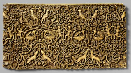
- Islamic (Unknown); Plaque; 10th-early 11th century. Image © The Metropolitan Museum of Art
In our previous post I introduced our new Principles and Elements of Design resource (which you can find in Teaching Resources under Studio Art) and spoke about the elements of design; in this post, we look at the principles.
As with the series of Elements of Design image groups, each of these includes an explanatory essay with helpful links to further reading. It bears repeating here that my approach is but one of many; since an image group can be copied and then altered as needed, we thought it might serve as a valuable starting point for studio teachers.
Once students can identify the elements of design, the next step is articulating how those elements support different principles of design. Seeing an element and being able to say how it functions in a composition requires an understanding of the principles of design.
The Principles of Design
-

- Titian; Man with Glove; c. 1520; Musée du Louvre. Image and original data provided by Erich Lessing Culture and Fine Arts Archives/ART RESOURCE, N.Y.; artres.com
-

- Built by Ottoman royal architect Sinan; Mausoleum of Sultan Selim II; 1576-1577; Istanbul, Turkey. Image and original data provided by Shmuel Magal, Sites and Photos; sites-and-photos.com
Focal Point or Emphasis in Art and Design can sometimes be understood most easily through graphic design. I placed some of the World War I and II Posters from the University of Minnesota Libraries side by side with the works of Titian and Gauguin to reinforce that these principles are evident in all aspects of visual communication. Once students see focal points or focal areas in one composition, they tended to notice them everywhere. As with many of the elements of design, learning the language of the principles empowered my students to look more closely at their world.

-

- Canaletto (Giovanni Antonio Canal); Venice: Santa Maria della Salute. Image © The Metropolitan Museum of Art
Putting together the Scale and Proportion group was probably the most fun because of the imaginative way artists have employed scale. Another aspect of scale is learning the actual dimensions of a work of art projected on the screen in class. Students are often surprised when they read the measurements in the image information. It is a perfect opportunity to discuss the difference between monumentality and size. Unknown ancient Egyptian sculptors and famous artists like Mary Cassatt, Robert Smithson, Jeff Koons, and Ron Mueck each have had something to contribute to the conversation about scale and proportion.
-
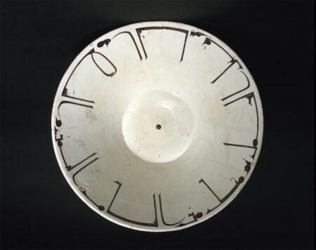
- Islamic (Unknown); Bowl; 10th century. Image © The Metropolitan Museum of Art
-
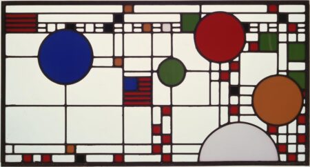
- Frank Lloyd Wright; Clerestory Windows from Avery Coonley Playhouse Riverside, Illinois; 1912. The Museum of Modern Art, Architecture and Design Collection; © 2007 Frank Lloyd Wright Foundation / Artists Rights Society (ARS), New York
Balance, Positive and Negative Space in Art and Design may seem like a handful, but I chose to teach about the many ways to achieve balance alongside ideas of positive and negative spatial relationships because they intersect intimately. In the early unit Shape, Form, and Volume in Art and Design, I introduced positive and negative space because it comes naturally in that context. In this group, we dive deeper and fold in the element of color. Including both two- and three-dimensional examples here permits students to confront the representation of space holistically. In this spirit, this group includes textiles, ceramics, and Native American baskets.
-
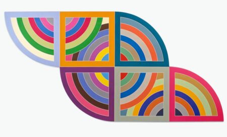
- Frank Stella; Harran II; 1967. Image and original data provided by ©The Solomon R. Guggenheim Foundation, New York; © 2008 Frank Stella / Artists Rights Society (ARS), New York
Rhythm, Pattern, and Repetition always got students moving, as we tapped on tables and cans to differentiate audibly between the repetition found in an American Quilt from the Metropolitan Museum of Art or a work by Frank Stella. Mondrian’s Broadway Boogie Woogie (also at the Met) could result in beatbox sounds as students would “hear” the composition from left to right or bottom to top. Often, this play with pattern resulted in some important clarifying discussions. When students compared chairs by Friedrich Wenzel, Frank Lloyd Wright, and Thomas Lamb and discussed the similarities and differences using these terms, the percussive noise transitioned to confident formal analysis.
-
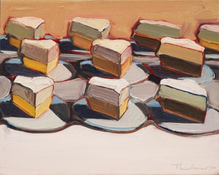
- Wayne Thiebaud; Cut Meringues, 1961. Image and original data provided by the The Museum of Modern Art; Art © Wayne Thiebaud / Licensed by VAGA, New York, NY. This work of art is protected by copyright and/or related rights and may not be reproduced in any manner, except as permitted under the Artstor Digital Library Terms and Conditions of Use, without the prior express written authorization of VAGA, 350 Fifth Avenue, Suite 2820, New York, NY 10118. Tel.: 212-736-6666, fax: 212-736-6767, email: info@vagarights.com.
-
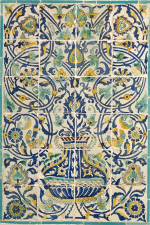
- Tunisia; Tile Panel; 18th century. Image and original data courtesy of the Doris Duke Foundation for Islamic Art; shangrilahawaii.org
Teaching Unity in Art and Design was more about learning what students had absorbed than about telling them what to notice. It was where the “see and say” approach to analyzing artwork using these terms gets tested. After weeks of open and often casual group discussions, I would ask students to take turns talking about what made a particular composition unified. They had to employ terms gleaned from their study of the principles and elements in a formal address to the class. At the time, I allowed students to choose their favorite work to discuss, but for this image group, my colleagues and I selected 24 very different works from the Artstor Digital Library. My favorites include The Moroccans by Matisse and the Guggenheim Museum Bilbao by Frank Gehry.
The studio art classroom is a different space in every school. Whether these groups are assigned to students to study on their tablet with Artstor Mobile or projected in class, we hope that they provide inspiration for students to look closely and describe what they see in their own artwork and that of peers and artistic heroes and ancestors.
— Dana Howard, Senior K-12 Relationship Manager